
Understanding how to read cryptocurrency charts is one of the most valuable skills any trader or investor can develop. Whether you are looking to trade Bitcoin, Ethereum, or any of the thousands of altcoins available on cryptocurrency exchanges, the ability to interpret price charts will help you make more informed decisions about when to buy, sell, or hold your positions.
Crypto charts may appear intimidating at first glance, filled with colorful bars, lines, and numbers that seem to require a finance degree to understand. The reality is that anyone can learn to read these charts with some basic knowledge and practice. This guide will walk you through everything you need to know, from the fundamental building blocks of chart analysis to advanced technical indicators used by professional traders.

What Are Crypto Charts?
Cryptocurrency charts are visual representations of price movements over time. They display historical data about how a cryptocurrency's price has changed, allowing traders to identify patterns, trends, and potential future movements. Every major crypto exchange provides charting tools, and dedicated platforms like TradingView offer advanced features for in-depth analysis.
At their core, crypto charts answer fundamental questions: Where has the price been? Where is it now? And based on historical patterns, where might it go next? While no chart can predict the future with certainty, understanding chart analysis gives you a significant edge over traders who make decisions based purely on emotion or speculation.
Charts serve multiple purposes in cryptocurrency trading:
- Price Discovery allows you to see current market prices and how they compare to historical levels
- Trend Identification helps determine whether a cryptocurrency is in an uptrend, downtrend, or moving sideways
- Entry and Exit Points reveal optimal times to buy or sell based on support, resistance, and momentum
- Risk Management enables setting appropriate stop-loss levels based on chart structure
- Market Sentiment provides insight into whether buyers or sellers are currently in control
Types of Crypto Charts
Before diving into analysis techniques, you need to understand the different types of charts available. Each type presents price data differently, and most traders develop preferences based on their trading style and the information they find most useful.
Line Charts
Line charts are the simplest form of price visualization. They connect closing prices over a specified period with a continuous line, creating a smooth representation of price movement. Line charts are excellent for beginners because they filter out noise and clearly show the overall direction of a trend.
However, line charts have limitations. They only display closing prices, omitting important information about price action during each period. You cannot see how high or low the price moved before settling at the close, which can be crucial for understanding market dynamics.
Bar Charts (OHLC)
Bar charts, also known as OHLC charts (Open, High, Low, Close), provide more detailed information than line charts. Each bar represents a specific time period and shows four key data points: the opening price, the highest price reached, the lowest price reached, and the closing price.
The vertical line of each bar spans from the low to the high, while small horizontal ticks on the left and right indicate the open and close prices respectively. Bar charts are popular among traditional traders but have largely been superseded by candlestick charts in the cryptocurrency space.
Candlestick Charts
Candlestick charts are the most popular chart type among cryptocurrency traders. Like bar charts, they display open, high, low, and close prices, but their visual presentation makes it easier to quickly assess market sentiment and identify patterns.
Each candlestick has a body (the wide rectangular part) and wicks or shadows (the thin lines extending above and below). The body represents the range between opening and closing prices, while the wicks show the highest and lowest prices reached during that period.
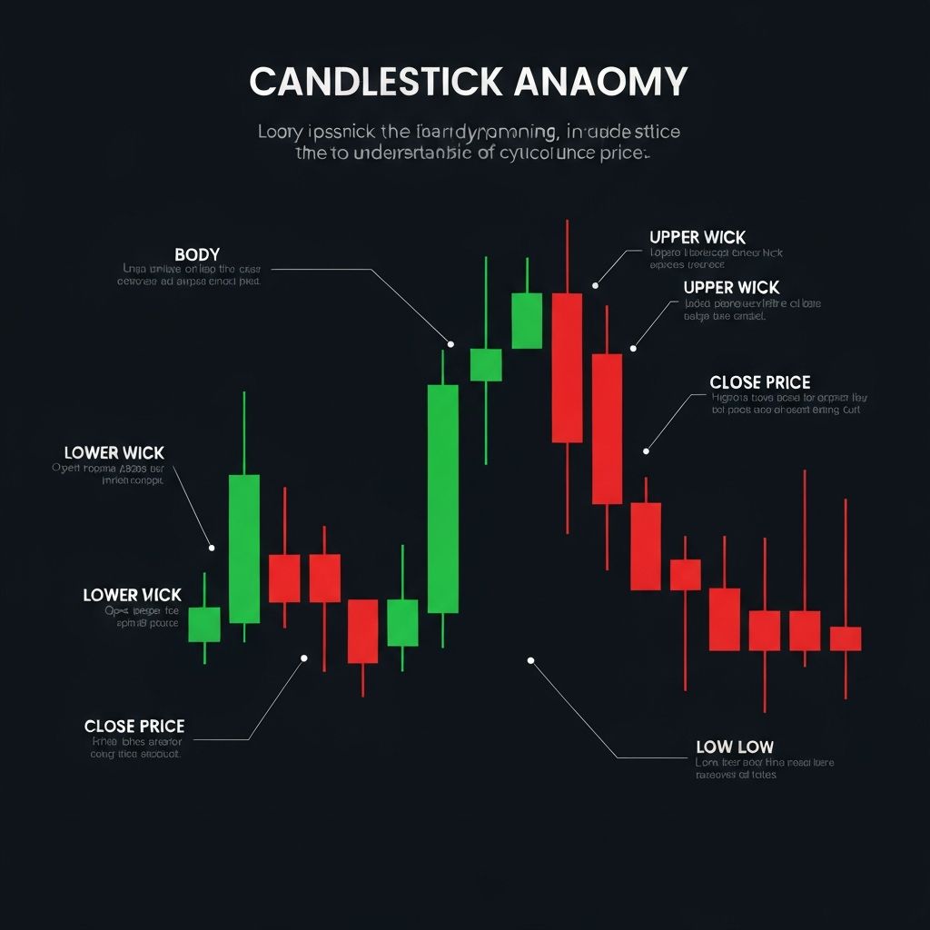
Understanding Candlestick Anatomy
Since candlestick charts dominate cryptocurrency trading, understanding their structure is essential. Each candle tells a story about the battle between buyers and sellers during a specific time period.
Candlestick Components
| Component | Description | Significance |
|---|---|---|
| Body | Rectangle between open and close | Shows price range of trading activity |
| Upper Wick | Line above the body | Highest price reached during period |
| Lower Wick | Line below the body | Lowest price reached during period |
| Green/White Candle | Close higher than open | Bullish period (buyers won) |
| Red/Black Candle | Close lower than open | Bearish period (sellers won) |
Reading Candlestick Colors
A green (or white) candlestick indicates that the closing price was higher than the opening price, meaning buyers pushed prices up during that period. This is considered bullish. Conversely, a red (or black) candlestick shows that the closing price was lower than the opening price, indicating sellers were in control. This is considered bearish.
The size of the candlestick body matters significantly. A large body indicates strong momentum in one direction, while a small body suggests indecision or consolidation. Long wicks reveal that prices moved significantly but were rejected, often signaling potential reversals.
Essential Candlestick Patterns
Candlestick patterns are specific formations that often precede predictable price movements. Learning to recognize these patterns can help you anticipate market turns and make better trading decisions.
Single Candlestick Patterns
Doji candles have nearly identical open and close prices, creating a cross-like appearance. They signal indecision in the market and often appear before trend reversals. A doji after a strong uptrend might indicate the bulls are losing steam.
Hammer candles have small bodies at the top with long lower wicks. They typically appear at the bottom of downtrends and suggest that sellers pushed prices down, but buyers stepped in to drive prices back up before the close. This is a bullish reversal signal.
Shooting Star candles are the opposite of hammers, appearing at the top of uptrends. They have small bodies at the bottom with long upper wicks, indicating that buyers pushed prices up but sellers took control by the close. This is a bearish reversal signal.
Multiple Candlestick Patterns
Engulfing patterns occur when a candlestick completely engulfs the previous candle's body. A bullish engulfing pattern shows a large green candle following a smaller red candle, suggesting a potential upward reversal. A bearish engulfing pattern is the opposite.
Morning Star is a three-candle bullish reversal pattern consisting of a large red candle, followed by a small-bodied candle (showing indecision), and then a large green candle. The Evening Star is its bearish counterpart.
Timeframes and Their Importance
Every chart has a timeframe setting that determines how much time each candlestick represents. Common timeframes range from one minute to one month, and the choice significantly impacts your analysis.
| Timeframe | Each Candle Represents | Best For |
|---|---|---|
| 1m, 5m, 15m | 1, 5, or 15 minutes | Scalping, day trading |
| 1H, 4H | 1 or 4 hours | Swing trading, intraday |
| 1D (Daily) | 24 hours | Swing trading, position trading |
| 1W (Weekly) | 7 days | Long-term investing |
| 1M (Monthly) | 30 days | Macro trend analysis |
A general rule is that higher timeframes provide more reliable signals but fewer trading opportunities, while lower timeframes offer more opportunities but with more noise and false signals. Many traders use multiple timeframe analysis, checking higher timeframes for the overall trend and lower timeframes for entry timing.
Support and Resistance Levels
Support and resistance are among the most fundamental concepts in technical analysis. Understanding these levels will dramatically improve your ability to read crypto charts and make trading decisions.
What Is Support?
Support is a price level where buying pressure historically overcomes selling pressure, preventing the price from falling further. Think of it as a floor that catches falling prices. When Bitcoin drops to a support level, buyers typically step in because they perceive it as a good value, creating demand that pushes prices back up.
Support levels form at previous lows, round numbers (like $50,000 for BTC), and areas of high trading volume. The more times a support level holds, the stronger it becomes. However, when support finally breaks, it often becomes future resistance.
What Is Resistance?
Resistance is the opposite of support, representing a price ceiling where selling pressure overcomes buying pressure. At resistance levels, traders who bought at lower prices take profits, and short sellers enter positions, creating supply that pushes prices down.
Resistance forms at previous highs, psychological round numbers, and areas where significant selling occurred in the past. Breaking through strong resistance with high volume is typically a bullish signal that can lead to significant upward moves.
Drawing Support and Resistance
To identify support and resistance on a chart:
- Look for areas where price repeatedly bounced or reversed
- Draw horizontal lines connecting these points
- Note that support and resistance are zones, not exact prices
- Pay attention to round numbers and previous all-time highs or lows
- Remember that broken support often becomes resistance, and vice versa
Technical Indicators for Crypto Charts
Technical indicators are mathematical calculations based on price, volume, or open interest that provide additional insights beyond raw price action. While dozens of indicators exist, mastering a few essential ones will serve most traders well.
Moving Averages
Moving averages (MAs) smooth out price data to show the overall trend direction. The two main types are Simple Moving Average (SMA) and Exponential Moving Average (EMA). The EMA gives more weight to recent prices, making it more responsive to new information.
Common moving average periods include the 50-day MA and 200-day MA. When the 50-day crosses above the 200-day, it forms a Golden Cross, which is traditionally bullish. When it crosses below, it forms a Death Cross, which is bearish.
Moving averages also act as dynamic support and resistance. In uptrends, prices often bounce off the 50-day or 200-day MA before continuing higher.
Relative Strength Index (RSI)
The RSI is a momentum oscillator that measures the speed and magnitude of recent price changes on a scale from 0 to 100. Readings above 70 suggest overbought conditions (price may be due for a pullback), while readings below 30 indicate oversold conditions (price may be due for a bounce).
However, in strong trends, RSI can remain overbought or oversold for extended periods. More reliable signals come from RSI divergences, where price makes a new high but RSI makes a lower high, suggesting weakening momentum.
MACD (Moving Average Convergence Divergence)
The MACD shows the relationship between two moving averages and helps identify momentum changes. It consists of the MACD line, signal line, and histogram. When the MACD line crosses above the signal line, it generates a bullish signal. When it crosses below, it generates a bearish signal.
The histogram visualizes the difference between the MACD and signal lines. Growing histogram bars indicate strengthening momentum, while shrinking bars suggest momentum is fading.
Bollinger Bands
Bollinger Bands consist of a middle band (usually a 20-period SMA) with upper and lower bands set two standard deviations away. The bands expand during volatile periods and contract during quiet periods.
When price touches the upper band, it may be overextended to the upside. When it touches the lower band, it may be overextended to the downside. A Bollinger Band squeeze, where the bands narrow significantly, often precedes a major price move.
Volume
Volume measures how many units of a cryptocurrency were traded during a specific period. It is one of the most important yet underutilized indicators. Volume confirms trends and breakouts. A price breakout with high volume is more likely to continue than one with low volume.
Key volume concepts include:
- Rising price with rising volume confirms an uptrend
- Rising price with declining volume suggests the uptrend may be weakening
- Breakouts should be accompanied by above-average volume
- Volume spikes often occur at market turning points
Chart Patterns Every Trader Should Know
Beyond candlestick patterns, larger chart patterns form over days, weeks, or months and can signal significant price moves. These patterns fall into two categories: continuation patterns (suggesting the trend will continue) and reversal patterns (suggesting the trend will change).
Continuation Patterns
Flags and Pennants are short-term consolidation patterns that form after sharp price moves. They represent a pause before the trend resumes. Flags are rectangular, while pennants are triangular. Both typically resolve in the direction of the prior trend.
Ascending and Descending Triangles form when price consolidates between a horizontal level and an angled trendline. Ascending triangles (flat top, rising bottom) are typically bullish and break upward. Descending triangles (flat bottom, falling top) are typically bearish and break downward.
Reversal Patterns
Head and Shoulders is one of the most reliable reversal patterns. It consists of three peaks: a higher middle peak (head) between two lower peaks (shoulders). When the price breaks below the neckline connecting the lows, it signals a bearish reversal. The inverse head and shoulders signals a bullish reversal.
Double Tops and Double Bottoms form when price tests the same level twice and fails to break through. A double top is bearish, forming an "M" shape at resistance. A double bottom is bullish, forming a "W" shape at support.
Step-by-Step Guide to Reading a Crypto Chart
Now that you understand the components, here is a systematic approach to analyzing any cryptocurrency chart:
Step 1: Choose Your Timeframe
Start with a higher timeframe (daily or weekly) to understand the overall trend, then move to lower timeframes for entry timing if you are actively trading.
Step 2: Identify the Trend
Determine whether the cryptocurrency is in an uptrend (higher highs and higher lows), downtrend (lower highs and lower lows), or ranging sideways. Trading with the trend generally offers better odds of success.
Step 3: Mark Support and Resistance
Draw horizontal lines at key levels where price has previously reversed. These levels will guide your entry, exit, and stop-loss decisions.
Step 4: Apply Technical Indicators
Add one or two indicators to confirm your analysis. Avoid cluttering your chart with too many indicators, as they can provide conflicting signals.
Step 5: Look for Patterns
Scan for candlestick patterns at key levels and larger chart patterns that might signal upcoming moves.
Step 6: Check Volume
Confirm that volume supports your analysis. Strong moves should have strong volume.
Step 7: Plan Your Trade
Based on your analysis, determine your entry price, target price, and stop-loss level before entering any position.
Common Mistakes to Avoid
Even experienced traders make errors when reading crypto charts. Being aware of common pitfalls can help you avoid costly mistakes:
Overcomplicating Analysis happens when traders add too many indicators, resulting in analysis paralysis. Keep your charts clean and focus on a few reliable tools.
Ignoring the Broader Trend leads traders to take counter-trend trades that have lower success rates. Always know the higher timeframe trend before trading lower timeframes.
Confirmation Bias causes traders to see only what they want to see on a chart. If you are bullish on a coin, you might ignore bearish signals. Approach each chart objectively.
Neglecting Risk Management is perhaps the most dangerous mistake. No matter how perfect a setup appears, always use stop-losses and never risk more than you can afford to lose.
Trading Without a Plan leads to emotional decisions. Before entering any trade, know your entry, target, stop-loss, and position size.
Where to Read Crypto Charts
Several platforms offer excellent charting tools for cryptocurrency analysis:
| Platform | Best For | Key Features |
|---|---|---|
| TradingView | All skill levels | Advanced charts, social features, alerts |
| Binance | Active traders | Integrated trading, TradingView charts |
| Coinbase | Beginners | Simple interface, educational content |
| Coinglass | Derivatives traders | Liquidation data, funding rates |
| CoinMarketCap | Research | Market data, basic charts |
Benefits of Learning Chart Analysis
Mastering crypto chart reading provides several advantages:
- Better Entry and Exit Points help maximize profits and minimize losses
- Reduced Emotional Trading by relying on objective analysis rather than fear and greed
- Improved Risk Management through proper stop-loss placement based on chart structure
- Greater Market Understanding of how supply and demand affect prices
- Applicability Across Markets since technical analysis skills transfer to stocks, forex, and commodities
Risks and Limitations of Technical Analysis
While chart analysis is powerful, it is not infallible. Understanding its limitations helps you use it more effectively:
Self-Fulfilling Prophecies occur because many traders watch the same patterns and levels, which can make them more likely to play out. However, this also means when expected patterns fail, moves can be sharp.
Fundamental Events like regulatory announcements, exchange hacks, or major partnerships can overwhelm technical patterns. Always stay informed about news affecting your positions.
Market Manipulation is more common in cryptocurrency than traditional markets due to lower liquidity and less regulation. Large players can paint charts to trap retail traders.
Past Performance does not guarantee future results. Patterns that worked historically may not work in changing market conditions.
Conclusion
Learning how to read crypto charts is an essential skill for anyone serious about cryptocurrency trading or investing. While it takes time and practice to become proficient, the concepts covered in this guide provide a solid foundation. Start with the basics of candlestick charts, support and resistance, and gradually incorporate indicators and patterns as you gain experience.
Remember that technical analysis is just one tool in a trader's toolkit. Combine it with fundamental analysis, proper risk management, and continuous learning to improve your results over time. The cryptocurrency market operates 24/7, providing endless opportunities to practice and refine your chart reading skills.
Ready to put your knowledge into practice? Check out our exchange reviews to find a platform with excellent charting tools, or explore our cryptocurrency guides for more educational content on trading strategies and market analysis.
